Lumia Mobile App - 2022
Designing group payments for an electricity app
Role:
Lead Designer
Duration:
8 Weeks
Output:
Group/Split Payment Feature

Background
In the wake of a Lumia app update, the company wanted to add more features to increase value for their users and the split payment feature was one of the features they wanted to include:
Save and manage meter details
Wallet payment system
Provision of downloadable bills
Split/group payment
Rural / Offline payment
Challenge
Add more features to Lumia mobile app starting with split/group payment to help Lumia provide more value added services to its customers and gain more customers.
Outcome
We designed the group payment feature for the mobile app, creating a new design system in the process to guide the design on other platforms and/or products.
Research
Do our customers need this feature?
We started by trying to find out if and how the customers would like the split payment feature to work. We sent out emails that linked to online questionnaires to recruit respondents specifically targeting account numbers that have been paid on by multiple users. The following were some key findings from our research
Of the respondents, very few people have a positive experience when it comes to getting their money back from utility payments.
People would prefer to not have conversations/reminders about repayments
The majority prefer a pot to be funded before bills are paid rather than having to chase for repayment
Everyone wanted a good amount of transparency in the payments
The majority of the respondents believe that repayment for bills that have been agreed should be automatic
Almost half of the people that have had to split bills have lost money because they never got paid back.

Workshops and Ideation
Turning research into real solutions
Using insights from the questionnaire and competitive analysis, we organized online brainstorming sessions to explore how the group payment feature could work. I facilitated these sessions, pairing each designer with a teammate from engineering or customer success. Together, they analysed other split payment apps and shared their findings to inspire ideas for Lumia’s solution.

Ideas from the brainstorm sessions were turned into user stories that defined the key actions users should be able to take. We then mapped the main processes into user flows using Miro.


Solution Design
We sketched, tested, and got feedback from stakeholders
We began by sketching several design styles for the screens, knowing each team would approach even simple screens like login differently. These options became the foundation for the app’s design language, shaping elements such as form fields, buttons, and overall look and feel.


Sketches of different login and group details screen options
Next we created low-fidelity wireframes of the screens that were sketched out and then the wireframes were inserted into the flow sequence. This exercise ensured that all screens required in the processes were all accounted for.


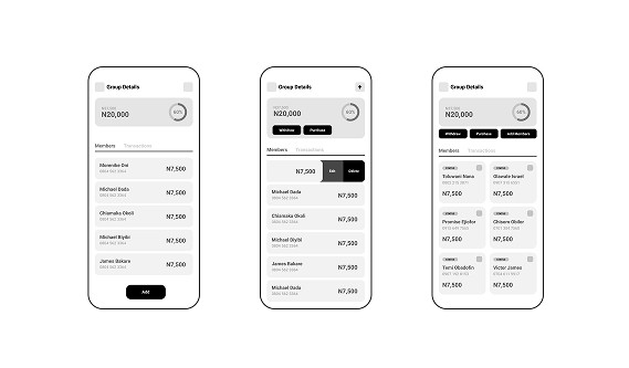
Low fidelity wireframes options for the login, home, and group details pages
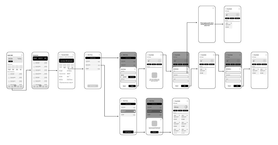
Wireframes + Userflows
High Fidelity Design
Design System…one atom at a time
To build the high-fidelity designs, we first established a design system in Figma using the brand’s colours, fonts, and an updated icon library. Following Atomic Design principles, we created atoms, molecules, and organisms, which formed the foundation for a robust system. This system was then applied to produce hi-fi designs, refined through multiple iterations of in-house testing and feedback.

Atomic elements of the developing design system.
We designed 20 screens for this feature, which went through testing, reviews, and several iterations over multiple sprints. Feedback from key stakeholders—including customer support, the product owner, and the dev team—shaped the final outputs shown below.

The evolution of the home screen design over the different iterations

Initial vs redesigned home screen
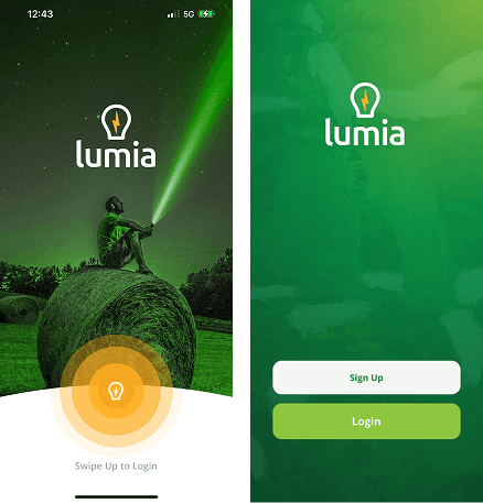
Initial vs redesigned splash screen
Conclusion
Interesting insights from this project
Most of the customers agreed that this was a feature they would use
2 out of the 8 testers voiced their concern for learning a new feature but were happy to still try it out
5 people said its a feature that will make Lumia stand out clearly from the competition.
This was my first time leading a design team with an agile approach and involving stakeholders in design thinking. I’m proud of the outcome, it sparked great ideas from unexpected sources, built stronger commitment to the product, and gave the design team valuable insights.
Next steps
We intend to fully build out the design system and then wrap up designs for Lumia version 2 by the end of Q3 2022. Subsequently apply the new design system across customer facing and back-room applications for the brand.